The Colour Forecast: What Summer 2026 Looks Like Now
FASHION ROOM BY ANJNA KAUR
If last summer was defined by restraint, by soft pinks and muted neutrals that never risked saying too much, summer 2026 moves in an entirely different direction. It does not rely on a single defining colour or a dominant trend that dictates the mood of the season. Instead, it offers something more layered and more expressive. It presents a spectrum. This spectrum is not just visual. It feels emotional, almost psychological. Each shade carries a distinct energy, suggesting not just how a woman might look, but how she might feel inhabiting that look. There is a sense that fashion is no longer simply about appearance. It is about internal states translated into colour, texture, and movement. Once you begin to notice this shift, it becomes impossible to ignore.
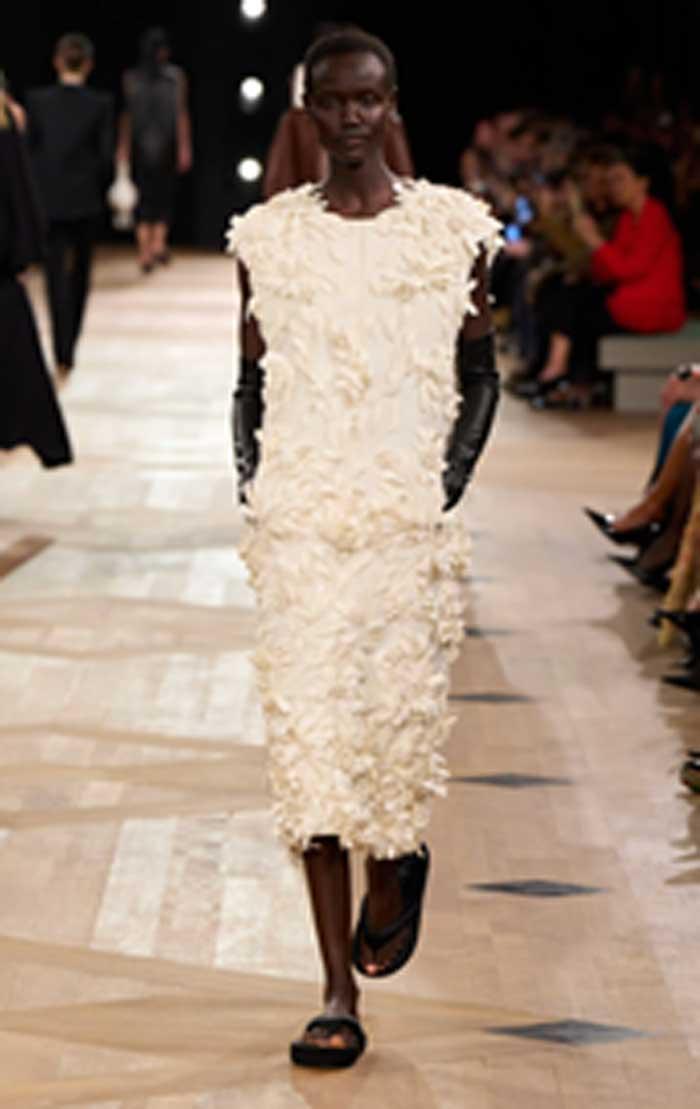
At the heart of this evolving palette is Cloud Dancer, a soft and creamy white that quietly replaces the stark minimalism of previous seasons. This is not the sharp, almost clinical white that once dominated modern wardrobes. It does not demand precision or perfection. Instead, it feels warmer and more human. There is a softness to it, a subtle depth that allows it to move naturally with the body rather than sitting rigidly on top of it. Cloud Dancer absorbs light rather than reflecting it harshly. It creates a gentle glow, the kind that flatters rather than exposes. Designers have embraced this quality fully, building entire looks around it. Linen sets that drape effortlessly, fluid dresses that shift with every step, tailoring so light it almost disappears. The focus is not on structure or severity, but on ease. Wearing this shade feels like stepping into a quieter space. It suggests calm, clarity, and a kind of quiet control. In a world that often feels overstimulated and unpredictable, Cloud Dancer offers a visual exhale. It does not try to dominate the room. It creates a sense of balance within it.
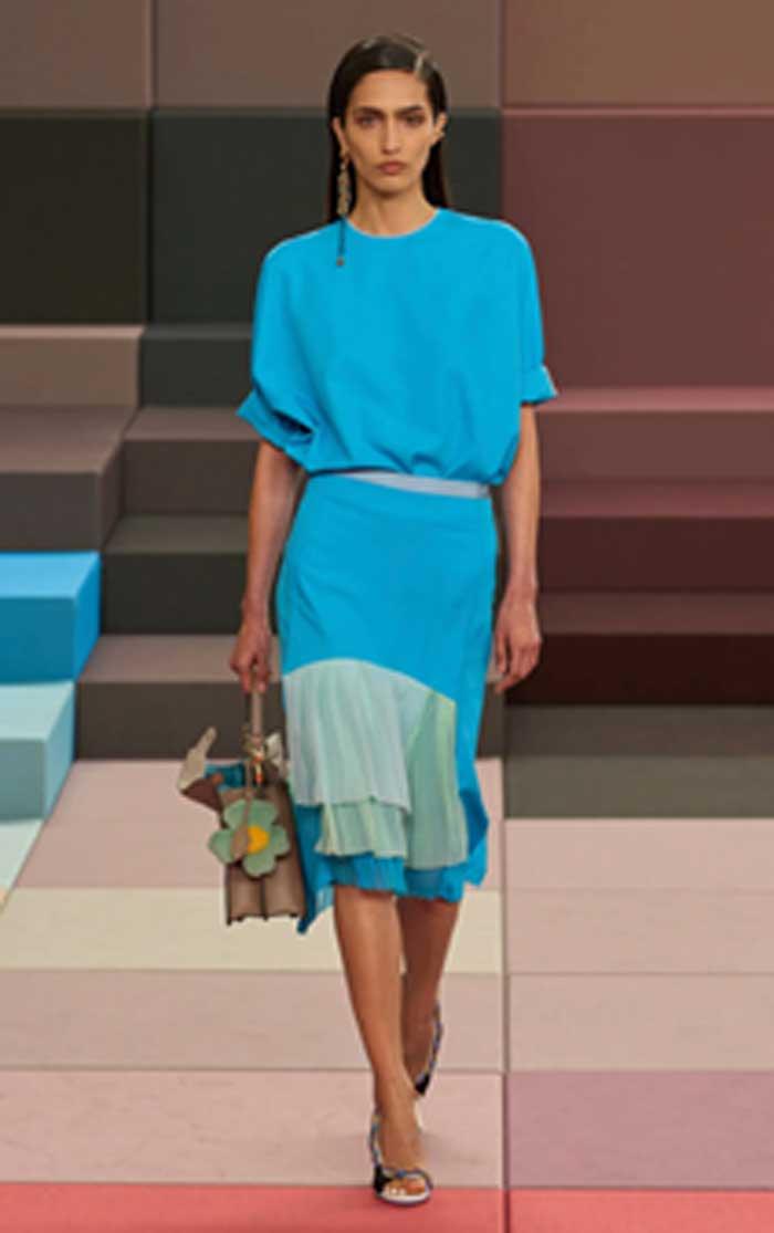
From this soft foundation, blue emerges as the emotional layer that gives the palette its depth. Sky blue leads this shift, appearing almost weightless in its lightness. It evokes open air and wide horizons, the feeling of space rather than confinement. There is an effortlessness to it that defines some of the most compelling summer dressing. A slip dress in sky blue feels instinctive rather than planned. A loose shirt thrown over swimwear suggests spontaneity rather than calculation. These are pieces that do not demand attention yet inevitably draw it. They reflect a kind of quiet confidence, one that does not need to prove itself.
Alongside this softness comes turquoise, a more assertive interpretation of blue. It carries brightness and clarity, but also a subtle edge. There is a hint of nostalgia within it, recalling early 2000s glamour, yet it is refined in a way that feels distinctly current. This is not playful in a youthful sense. It is playful with intention. Turquoise adds sharpness to the palette, offering contrast without disrupting its overall harmony. It feels like a deliberate choice rather than an impulse, a colour that understands its impact. Together, sky blue and turquoise create a dialogue between ease and confidence, between softness and precision.
This movement toward blue signals a broader shift in fashion’s emotional language. There is a clear departure from heaviness, from anything that feels overly constructed or restrictive. Instead, there is a focus on lightness, on clothing that allows for movement both physically and emotionally. It reflects a desire for simplicity, but not in a minimal or reductive way. It is simplicity with depth.
Then come the shades that feel infused with sunlight. Butter yellow continues its quiet presence, but it evolves this season into something more sophisticated. It is no longer overly sweet or delicate. It has gained a certain refinement, appearing in sheer layers and fluid fabrics that seem to dissolve into the skin. This version of yellow feels intimate. It does not sit on the surface. It blends, softening edges and creating a sense of warmth that feels almost personal. It is less about standing out and more about creating an atmosphere.
In contrast, burnt orange grounds the palette. It introduces richness and depth, drawing on tones that feel sun soaked and slightly earthy. Where butter yellow suggests early light, burnt orange evokes the end of the day. It carries the warmth of fading sunlight, when everything becomes deeper and more saturated. There is something inherently sensual about this shade. It does not need embellishment or complexity. Its richness speaks for itself. When paired with lighter tones, it creates balance. When worn alone, it feels immersive. Together, butter yellow and burnt orange define what can best be described as golden hour dressing. These are colours that come alive as the light shifts, that interact with their surroundings in subtle but powerful ways. They are not static. They evolve throughout the day, becoming more compelling as evening approaches.
Golden hour dressing is less about specific pieces and more about a feeling. It is the moment when everything aligns, when the environment enhances what is being worn rather than competing with it. It captures a sense of ease and quiet confidence, of being fully present in a fleeting moment. Yet no palette is complete without tension. Without contrast, even the most beautiful colours risk becoming predictable. This season introduces that tension through tomato red.
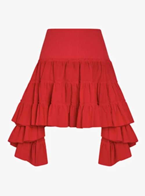
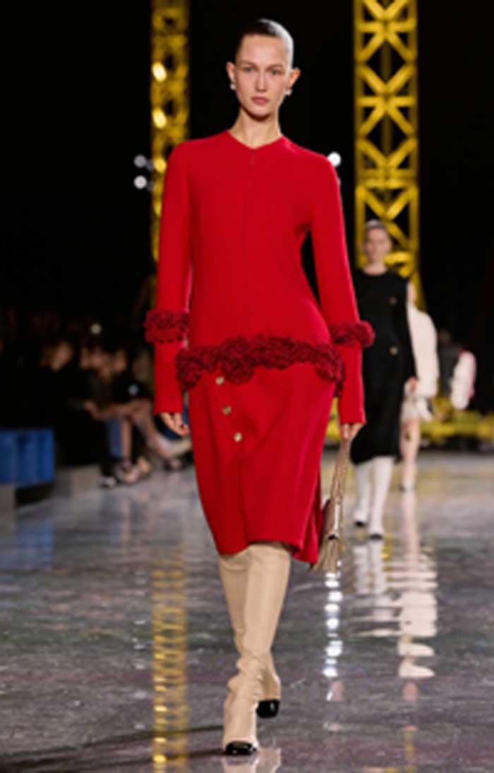
Tomato red is immediate and unapologetic. It does not ease into the palette. It interrupts it. Bright and vivid, it cuts through the softness of the surrounding shades, creating a sharp and deliberate contrast. It demands attention in a way that none of the other colours attempt to. This is not a colour used sparingly. Designers have embraced it fully, presenting it in head to toe looks, bold dresses, and striking accessories. It is not about subtlety or understatement. It is about presence. Tomato red acts almost like punctuation within the broader narrative of the season. Where other shades suggest calm or introspection, this one asserts itself. It creates moments of intensity, of clarity, of bold expression. It reminds us that softness does not have to exclude strength.
The interplay between these colours is what defines the season as a whole. It is not about choosing one mood over another. It is about moving between them, allowing different aspects of identity to surface through what is worn. Cloud Dancer offers stillness. Blue introduces lightness and emotional clarity. Butter yellow and burnt orange bring warmth and depth. Tomato red provides energy and interruption. Each shade contributes to a larger story, one that feels more complex and more human than the rigid trends of the past. This approach to colour reflects a broader shift in how fashion is understood. It is no longer about uniformity or adherence to a single aesthetic. It is about fluidity, about embracing change and contradiction. A woman can be calm and bold, soft and sharp, understated and expressive, sometimes all within the same day.
Summer 2026 does not dictate how she should feel. It gives her the tools to express how she already does. There is something quietly radical in that idea. Instead of imposing a singular vision, fashion becomes a mirror, reflecting the nuances of real experience. It acknowledges that identity is not fixed, that mood and environment shape how we present ourselves.
This season’s palette invites exploration. It encourages experimentation without pressure. There are no strict rules, no expectations of perfection. The beauty lies in the interplay, in the way different tones interact to create something personal and unique. In the end, what makes this shift so compelling is its subtlety. It does not rely on extremes or shock value. It builds its impact through nuance, through the careful balance of softness and strength, lightness and depth. Once you begin to see it, it becomes clear that this is not just a change in colour trends. It is a change in perspective. Fashion is no longer just about being seen. It is about being felt.